Flowhub
A rebrand for Flowhub, the commerce platform thousands of specialty retailers run their stores on. Identity, website and product UI designed as one system.
Overview
From purple to Neon Moss
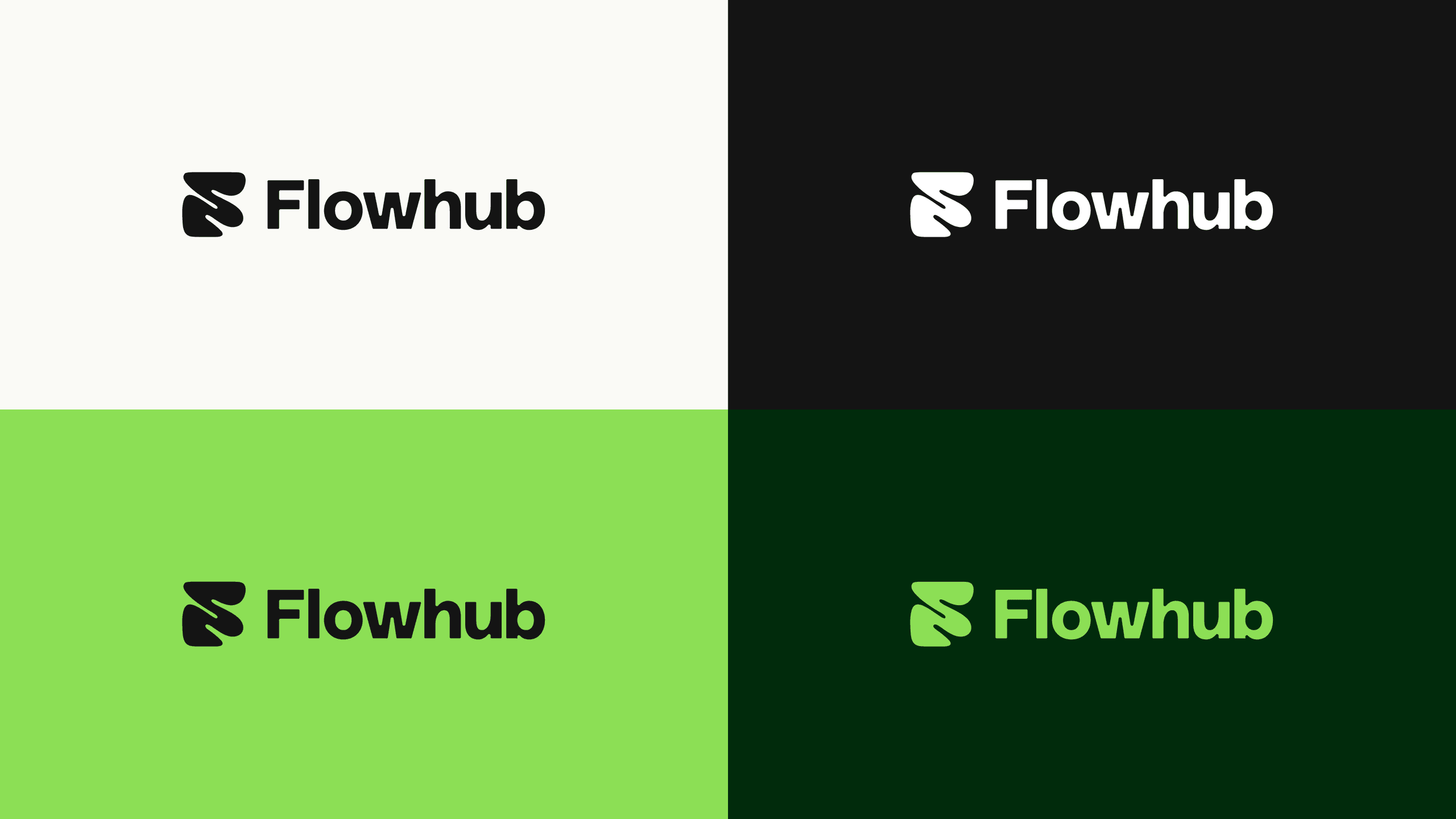
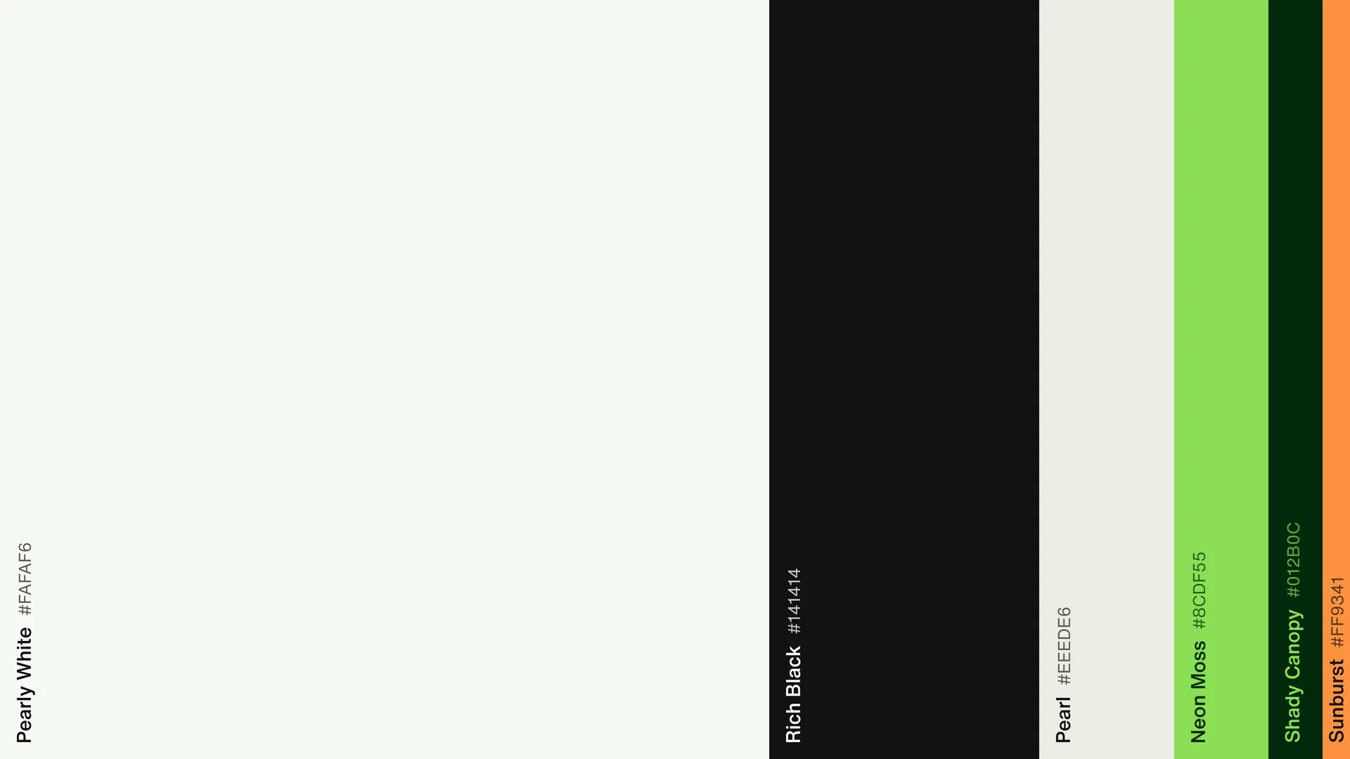
Flowhub runs point of sale, payments, ecommerce, marketing and reporting for specialty retailers across the US, from cannabis dispensaries to liquor stores and CBD shops. More than $4B in sales goes through it every year. We replaced its purple identity with a system built on one mark, Helvetica Now and a single bright green, then carried it into the website and the product UI, so the homepage, the dashboard and the payment screen at the counter are made from the same parts. Flowhub's own team built the new site from our designs.

Color and material
Green used as a signal
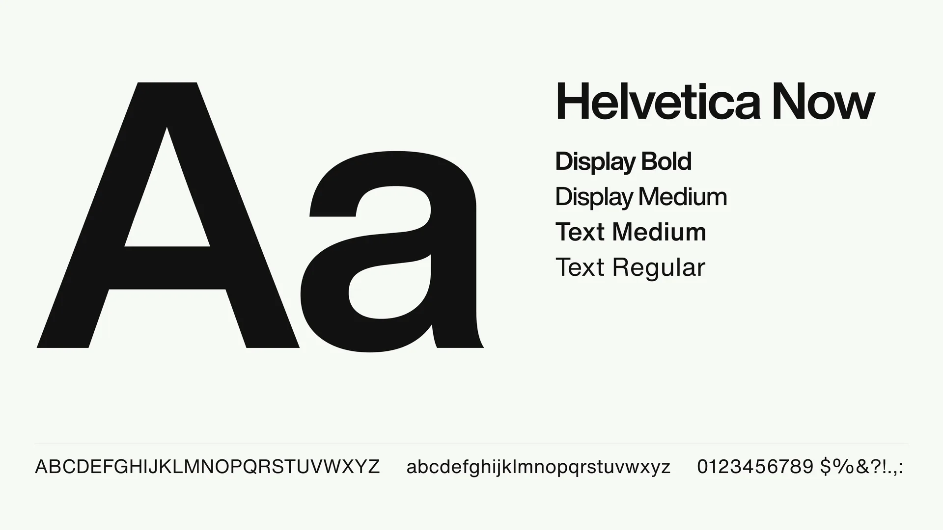
Most of every surface is Pearly White and Rich Black, with Pearl for panels. Neon Moss is the brand color and appears sparingly, usually on the one action that matters on a screen, so it reads as a signal when it shows up. Shady Canopy, a green so dark it reads as black, carries the brand on dark surfaces, and Sunburst orange is kept for anything that needs attention. Depth comes from two materials: liquid chrome for the mark and frosted glass for interface panels.

Website
Real screens on the homepage
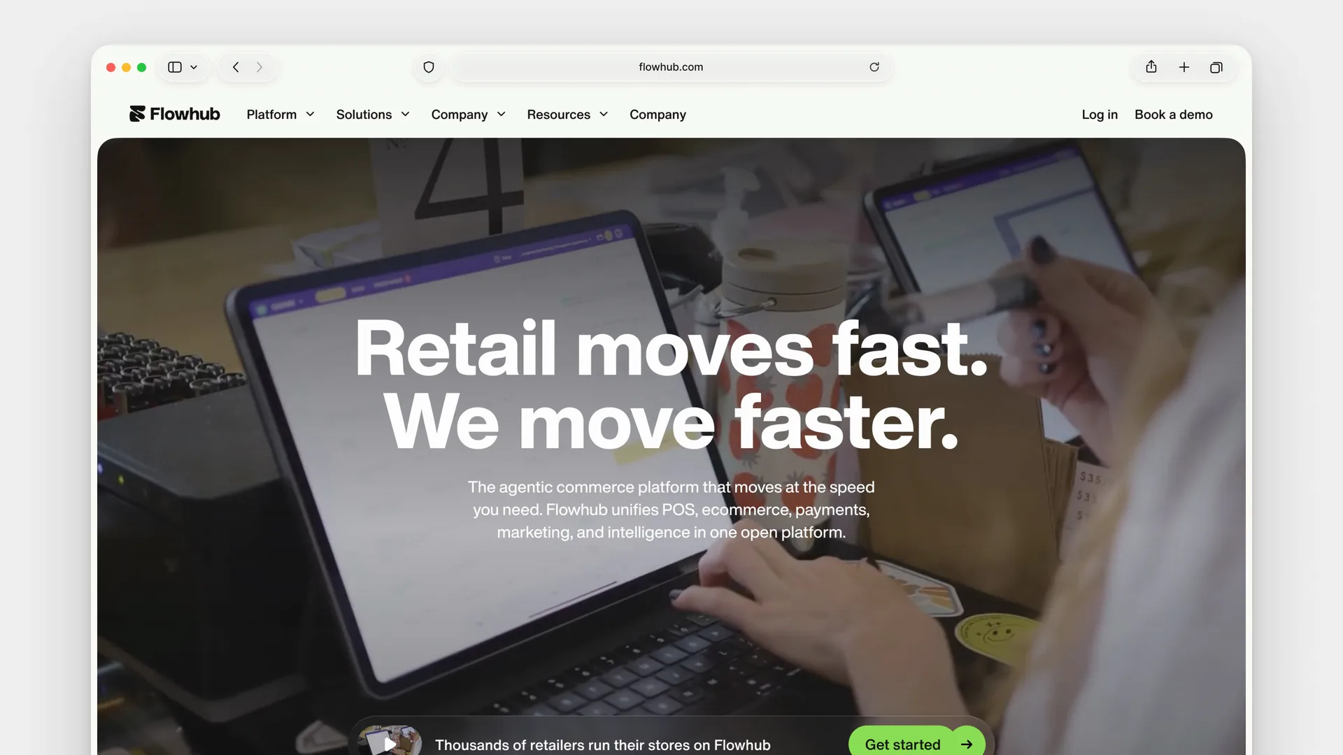
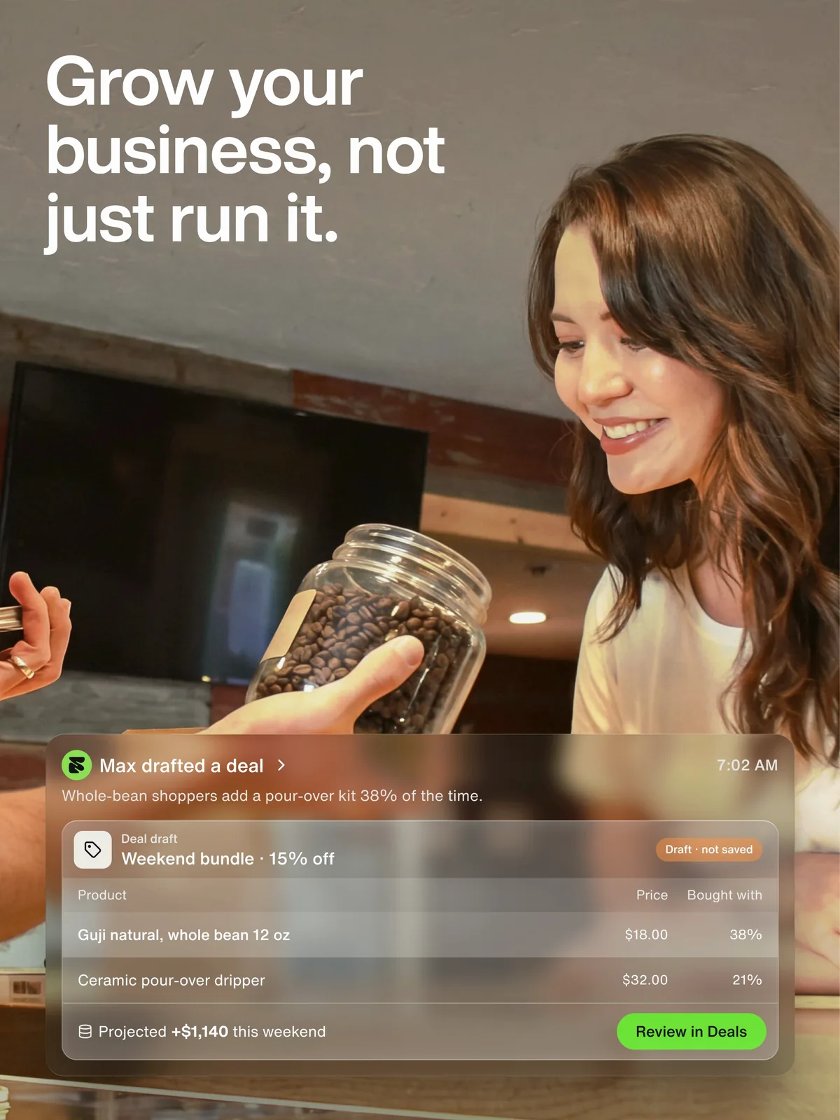
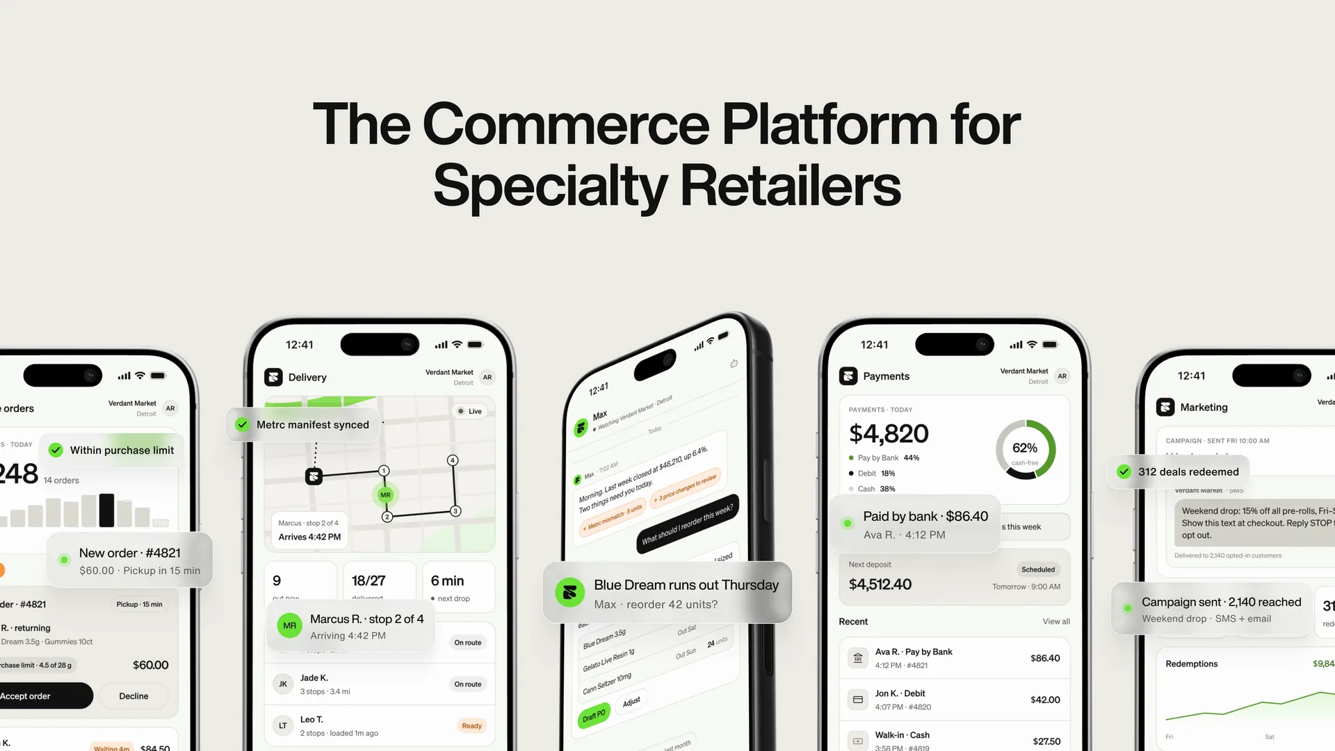
The homepage shows the product instead of describing it. Under the headline, a strip of retailer logos leads into Flowhub's hardware and apps (Maui OS, ecommerce, kiosk and delivery), each shown as the actual screen. Further down, the case for growing a store sits next to a photo with a live deal card over it, so the claim and the feature it depends on are on screen together.
Product UI
Glass panels and plain numbers
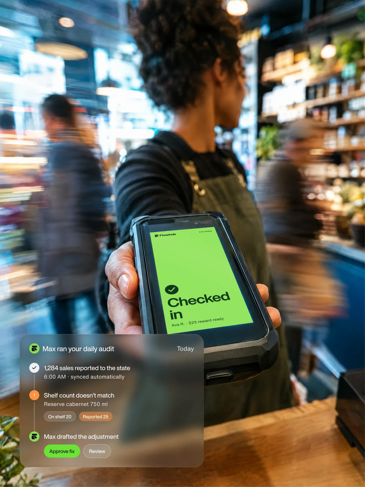
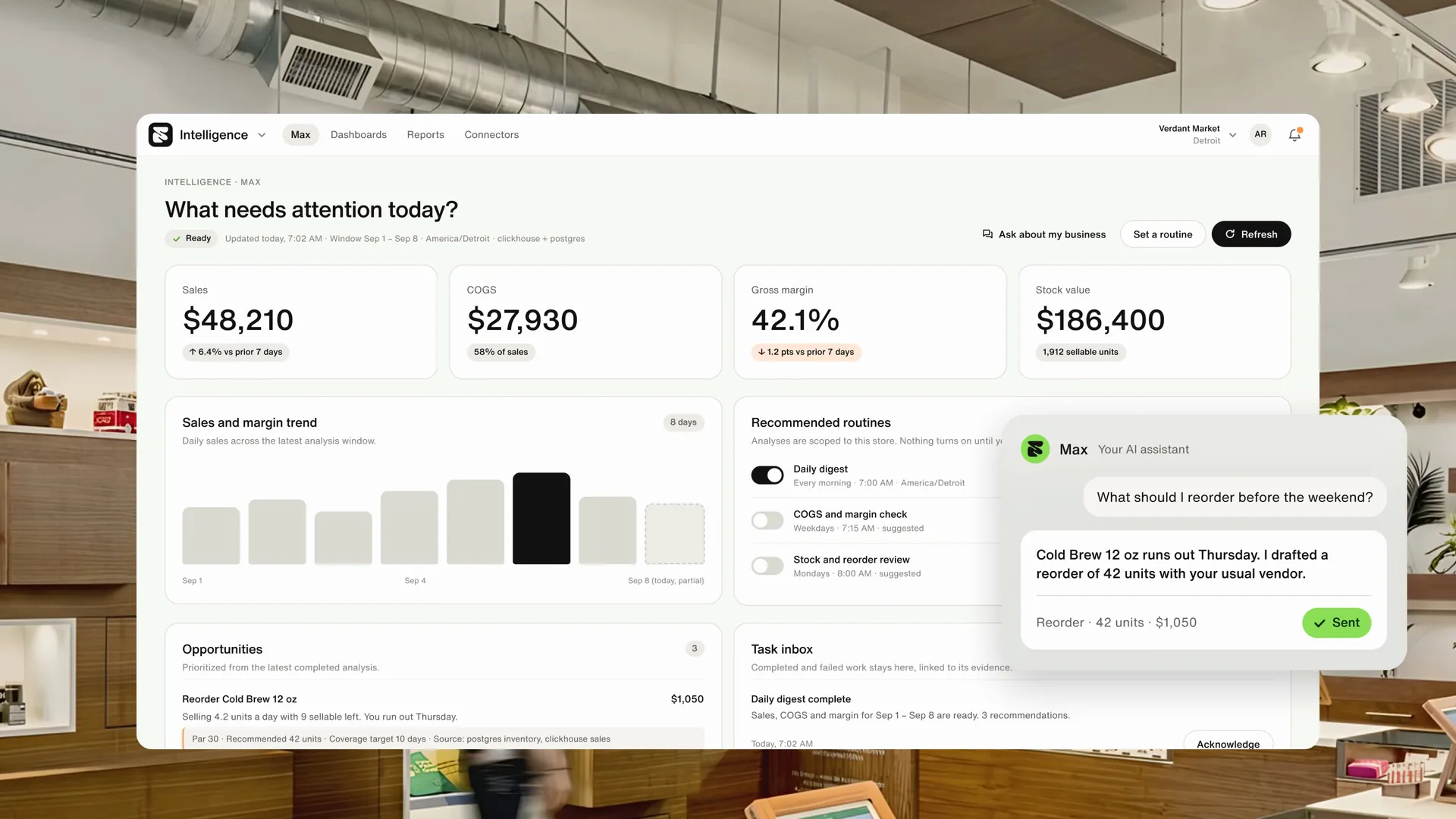
The product screens use the same parts as the brand: frosted glass panels, large plain numbers and one green action per screen. The Intelligence dashboard opens on what needs attention today, with sales, margin and stock value at the top. Max, the assistant in these designs, drafts work for a person to approve: a reorder before a bestseller runs out, a weekend bundle built from what shoppers buy together, an adjustment when a shelf count doesn't match the state report. Compliance checks such as ID verification and purchase limits show as small confirmations rather than blocking screens.

Proof
Trust signals in the same materials
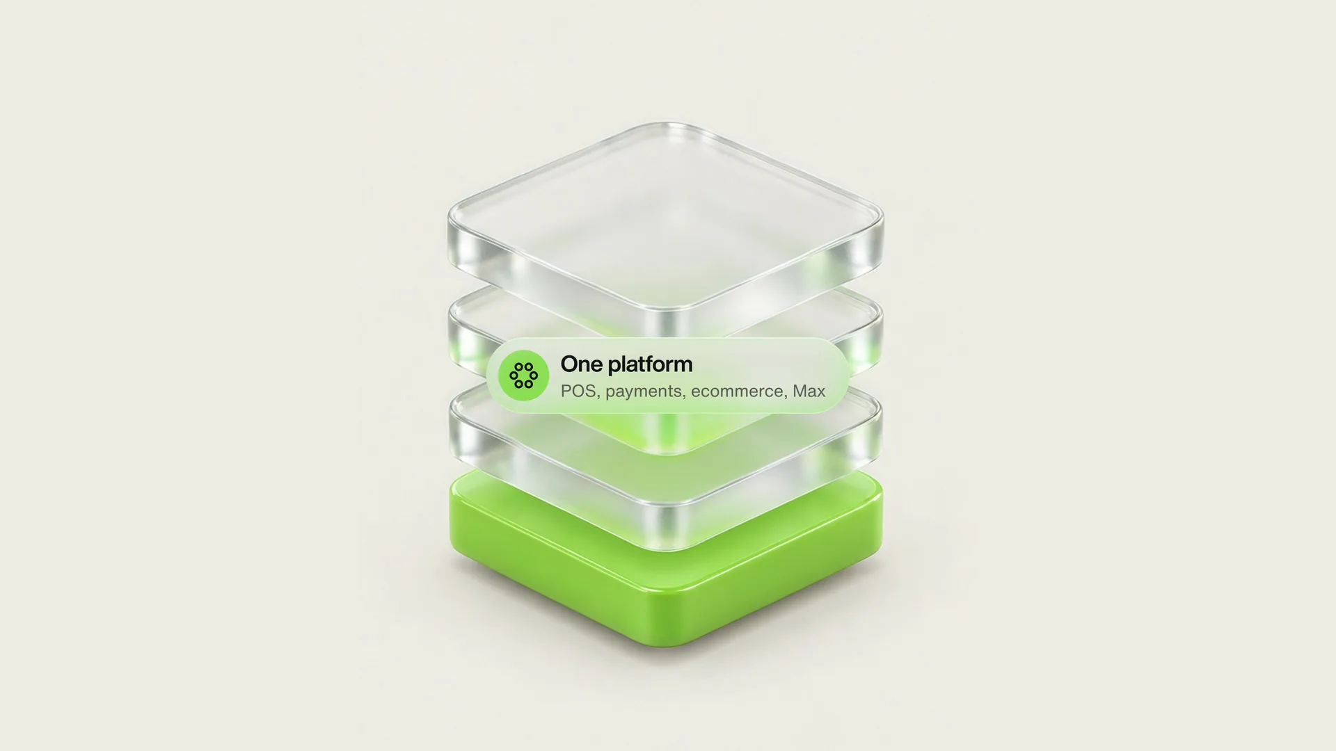
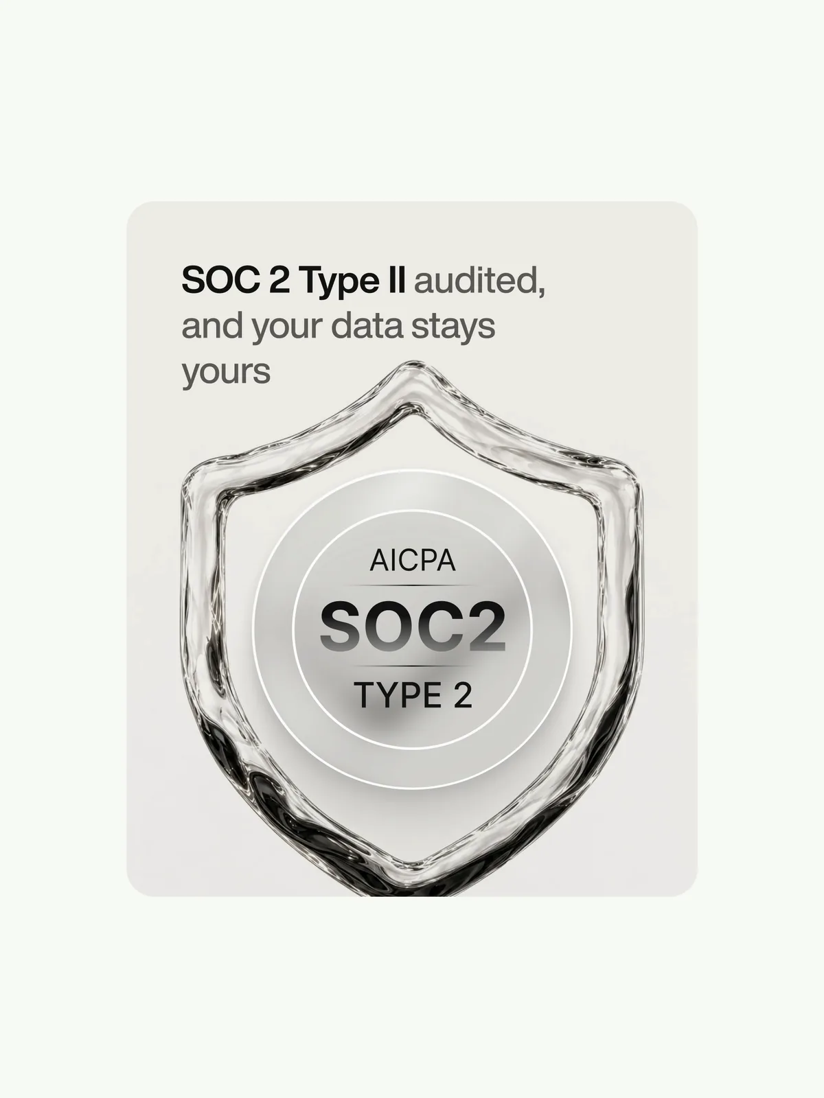
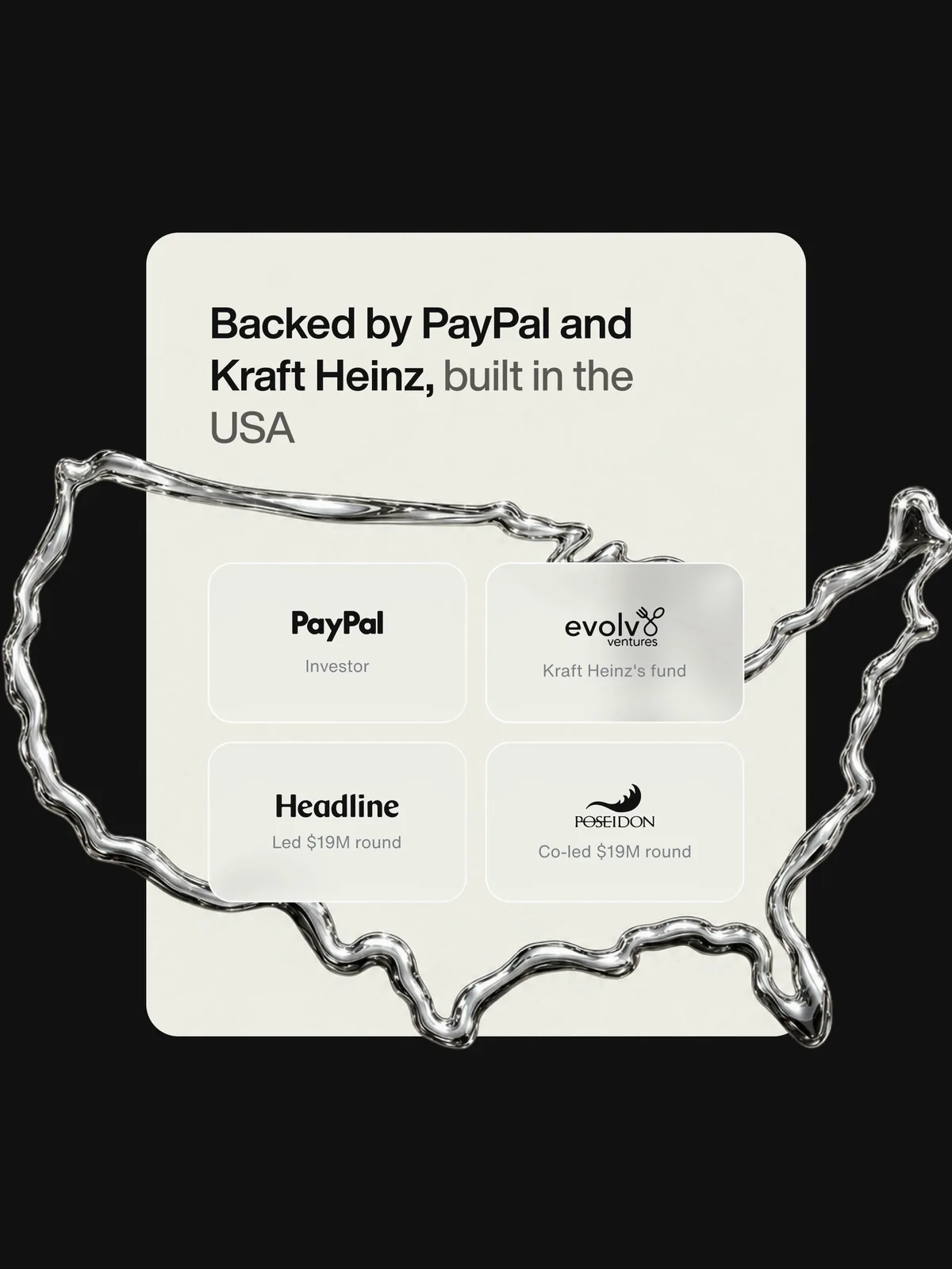
Security certification and investors usually end up in a strip of gray logos near the footer. We designed them with the materials used everywhere else: the one-platform stack (POS, payments, ecommerce and Max) as layered glass, SOC 2 Type II as a chrome shield, and the company's backers on a chrome map of the US.
Imagery
People mid-task
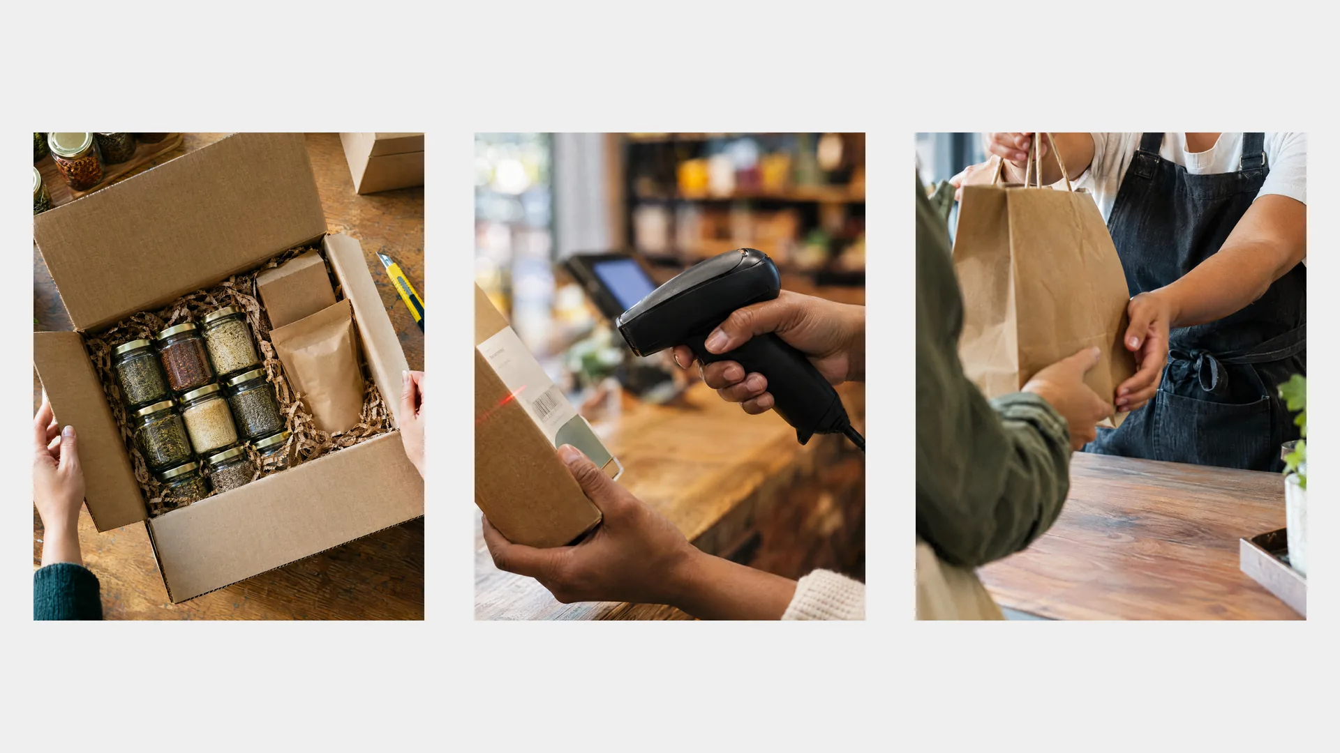
The image direction is warm light, close crops and people in the middle of running a shop: packing an order, scanning a box, passing a bag through a car window. The stores look like the independents Flowhub sells to, with wood shelving, plants and a POS on the counter. The mark appears only where a retailer would put it, on a paper bag or a staff jacket, so the pictures don't read as ads.



Out in the world
Concepts beyond the browser
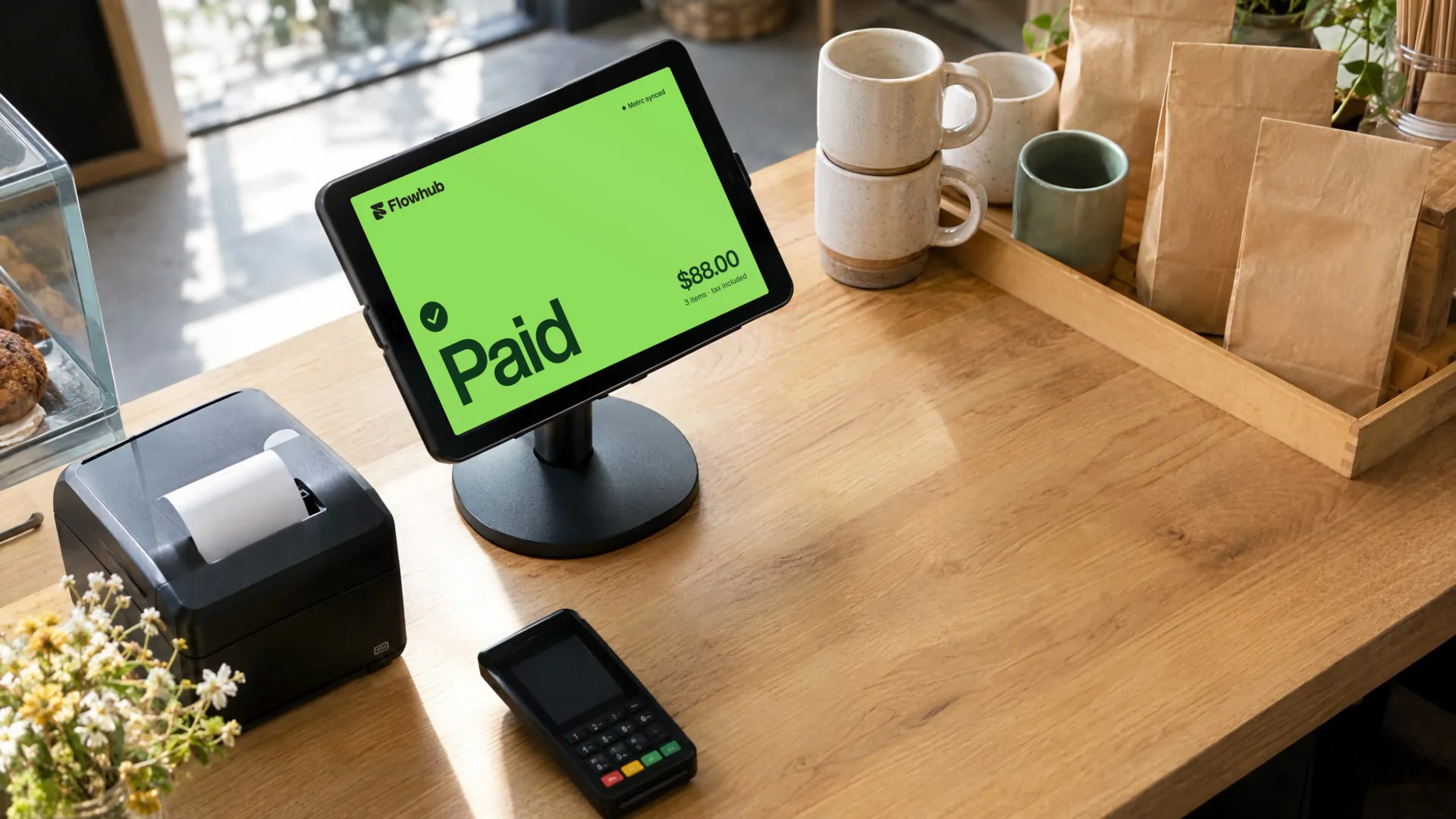
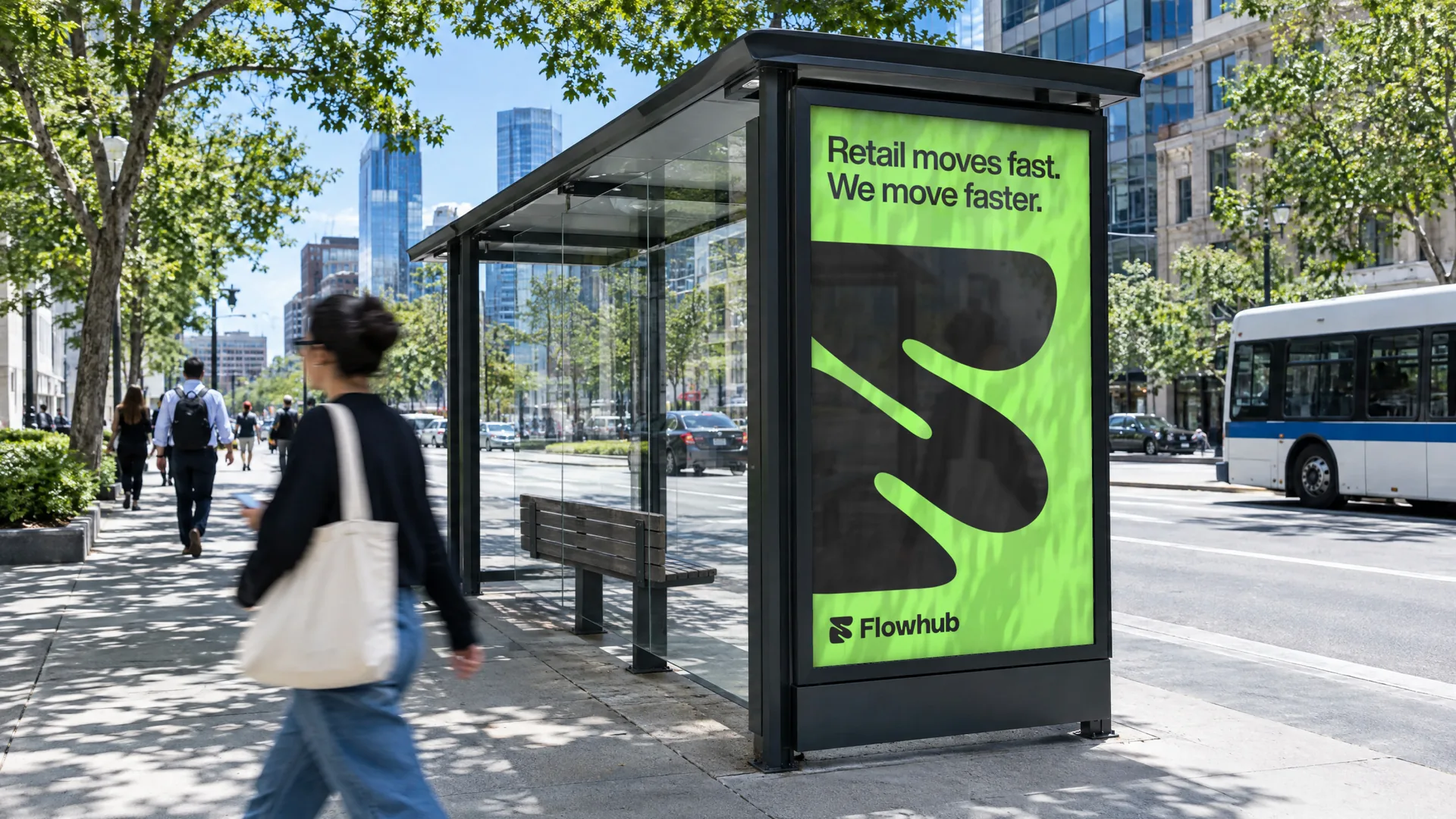
Two concepts test the system away from a screen you scroll. At the counter, the payment screen turns fully Neon Moss with one word, Paid, large enough to read from the customer's side. At a bus stop, a poster carries the brand line and a cropped mark that still reads at walking pace. Both use the website's type, color and mark, with no new rules added.
Common questions
Flowhub project FAQs
What buyers ask us about the Flowhub project, answered from the work itself
What did the Flowhub project include?
Can you hand designs over to our own developers?
How do you design product UI for regulated retail?
Why one accent color across the whole system?
Services

Get in touch
Tell us what you're building. We reply within one working day. Jono or someone on the team picks up every message personally.
You can also book a call.