I'm going to start this article by placing a bet that you've absolutely used a page-builder of some kind before. Let me fire off some quick opinions and tell me if they resonate.
- They're hard to maintain
- I can never find the block I want
- Surely this can be more efficient
Yeah, I know, that's basically most of the experiences we've heard from clients. We want to change that by putting together this blog so I can scream at developers the next time I see a disorganised mess for a page builder.
Why Sanity page builders don't suck
The best opinion (my opinion)
I'm going to take a leaf out of Simeon's book, and give you my opinions on page builders, and don't worry, they're unquestionably right and not to be disputed.
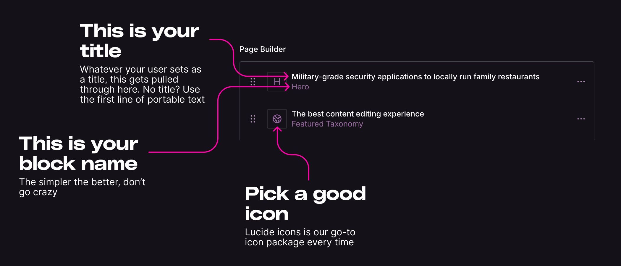
Here's how you should structure your previews in page builders

How does this look in code?
Well, assuming you've called the title: title and your image field imageThis is the exact way I would set up a preview inside the code.
What are those ?? about?
If you haven't seen those before, or you have seen them and you don't know what the difference is between those and || I'll let you in on a little secret that's definitely not generated from ChatGPT...
||is the logical OR operator, returning the right operand if the left operand is falsy.??is the nullish coalescing operator, returning the right operand only if the left operand is null or undefined.
Use ?? to specifically check for null or undefined values, ensuring that other falsy values like 0 or '' are not considered as missing values.
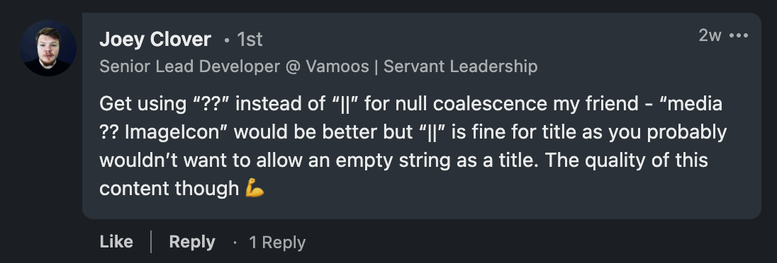
Or, in other words, because this asshole told me to use them.

Joey if you're reading this, I hope you're happy
Let's start with the new stuff
Before going further, let's talk about some of the new stuff that Sanity released that makes your page builder a bit better.
Array groups
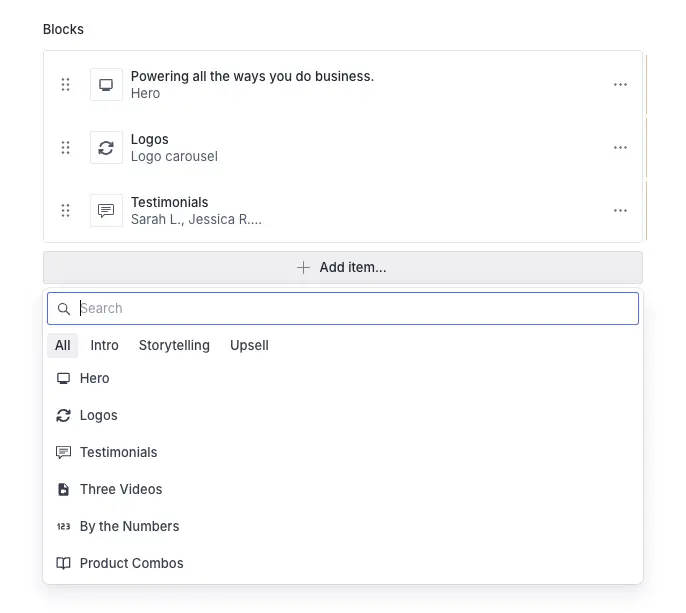
This lets you split your page builder blocks (arrays of blocks) into groups. It means if you want to split out Forms and Heros. You can easily do it with some basic code.
Here's how it looks in the Sanity Studio:

And here's the code to do that:
Fun fact: you can have a block in more than one grouping. It's pretty cool, for example, when you want a form block in both Forms and Engagement.
Array views
I know what you're thinking. Yeah, the above is pretty cool, but I still don't know what the hell my page builder block looks like, and it doesn't look like a 24px by 24px icon.
Well, first of all, you'd be right. Second of all, you now have something called array views. Yes, they're everything you're asking for.
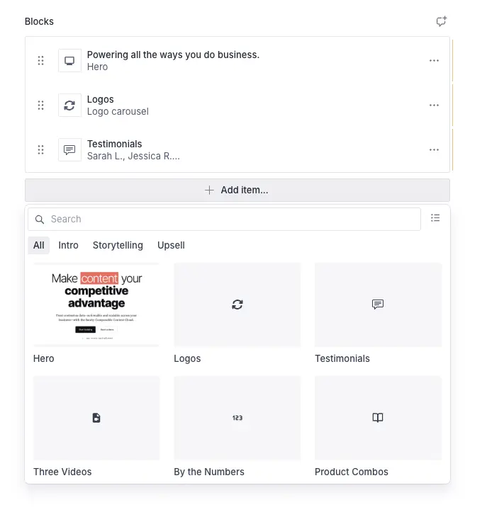
They allow you to see a whole bunch of blocks at once with thumbnails. Here's the visuals that aren't ripped straight from the docs
Here's how it looks in the Sanity Studio

And here's the code to do that
Pro tip: Use the same size canvas
Before you set this up, do everybody a favour and use the same size canvas for every screenshot, or else you're going to have a monstrosity of a visual representation of a block.
A nice, simple, and free way to handle this is to create a frame inside Figma and paste the screenshot into it, ensuring they are all the same height and width.
No spam, only good stuff
Subscribe, for more hot takes
See it in action
It's not recycling content if nobody watched the video the first time round... So here it is again, packaged into a blog. Please watch it.
Closing thoughts
I don't want to take you away from actually trying this yourself, so I implore you to stop reading this content and actually spin up Sanity and do this for your clients today. You will not believe the UX improvement from just integrating these changes above. If you want to go deeper on schema organization, check out our tips for building Sanity schema efficiently, and if your GROQ queries are getting out of hand, we have a guide on how to clean up your GROQ.
If, on the other hand, you can't be arsed and want somebody to "just sort it out for you," you can get in touch with the form below and we'll get you looking ship-shape in no time.

