


Google Analytics is a powerful tool for tracking conversions and website traffic, as well as gaining valuable insights into what people are doing on your website. It's just a shame that nobody knows how to read it correctly.
These insights are helpful in creating marketing strategies, figuring out issues with the website, and determining other useful statistics. Setting up Google Analytics is the first and in itself an intricate task. We will cover the setup user behavior process in a separate post. For now, we’ll assume you’ve already completed the prerequisites. If not, assuming you're using Next.js, click here and use this.
If you want this done for you without touching any dev work, click here.
Having your Google Analytics set up with your website, we are good to go with the next step of analysing the data. Taking the data and example from a dummy website, we'll look at what the data signifies and how it helps us use it in our business.
Google Analytics dashboard
 *google analytics home dashboard *
This is the initial dashboard that appears when you open Google Analytics. Let's review the basic structure and try to understand what's actually happening. This is more about theory than deep technical knowledge.
What to look for
The main indicators here are the graph, active users, key events, and average daily purchasers. The graph consists of one dotted line and one continuous line, along with a date picker for selecting the period for which the data is to be represented. It has currently been set to 1 year. On the right-hand side, we have the data of the active users, showing the active users of the last 30 days.
What this means
Imagine you own a business, the previous quarter of the year, the business was booming. Plenty of traffic on the website, a large number of key events being clicked, signifying the active user interaction with the website, and lots of sales because of the purchases being made. This year, the website is not doing great. There is a decline in the number of active users, as well as a decrease in interaction with the website and the number of purchases being made. This is what the data in the above picture indicates.
The dotted lines are consistently above the continuous lines. When you hover over any of these lines, you can see the difference between the matrices of the previous period and the following period. A variety of matrices can be selected and studied, ranging from user details to key events, as well as bounce rates and the number of purchases. Users can study any of these according to their business needs but as a good rule of thumb, we always want the solid line to be above the dotted line for positive interactions.
We will focus mainly on the active users and dig deeper into the problems and what can be done to solve them.
What to take away
From what we have observed, the sudden dip in traffic can be attributed to various factors, such as the absence of new products or content updates, irrelevant products, reduced ranking in search engines, incorrect campaigns, and not optimizing keywords, among others. We need to identify these factors by exploring other sections in Google Analytics and address these issues before we go bankrupt. So what's next?
Is your marketing strategy working?
Are you wondering if your marketing strategy is actually working? The best way to find out is to look at real data that shows how people are finding and interacting with your business.
The traffic acquisition report directly ties into your marketing strategy by showing you which of your marketing efforts are actually bringing visitors to your website. For example, if you’re running ads on Facebook and sending out email newsletters, the traffic acquisition report will break down how many visitors each channel is sending your way, how they behave once they arrive, and whether they’re converting into customers. This direct connection means you can see, in real numbers, whether your marketing strategy is working.
The next section explains how to set up a traffic acquisition report to translate your marketing moves into measurable results.
Setting up the traffic acquisition report
Hover to the left side of the screen, where a sidebar will slide up, showing a few options.
Go to reports -> acquisition -> traffic acquisition (Please note that the path and interface may vary, because Google changes their UI every couple of months).
You will see the traffic acquisition graph with an option to select the date range. Carefully, set the same date range that you had selected while observing the previous data. To compare the data of this period with the previous period, scroll down to the compare option and select the date range. Below is the visual path of setting it.
 Traffic acquisition data
Notice how we set our comparison dates (1) and (2) after enabling the compare option(3). After successfully setting the date range, you will have an interface just like the visuals below
 Appearance of the graph
Note: Ensure the date range aligns with the comparison we want to make. Now, this might not seem like it will help us in any insightful way, but wait - we've got something more. You can scroll down a bit to see what the data wants to convey. The data presented below is what we need to observe.
 *dataset *
Here's a spoiler: the red text representing the percentage changes is what we need to work on.
What to look for
Multiple channels have been identified from which the traffic primarily originates, including direct, organic, paid search, and others. The negative percentage change is where we need to focus because it is where the marketing campaign is lagging. Let's make some observations and decide plan of action. The only profitable action on the website is paid search; the rest are doing pretty terrible.
What this means
Only by observing the sessions columns of the various matrices can we see where the dip in the regular traffic is coming from.
Starting with the direct traffic, the dip of -37.99% may have several reasons, including technical ones. However, being skeptical that the dip is due to the marketing campaigns, we will assume that this dip is caused by a change in the marketing strategy or disruption of the brand awareness campaign.
Make sure to check if there were any changes in the direct marketing campaign to figure out the dip. The other reasons could be due to broken links, changed URLs, or a reduction in the number of direct users, so it may be necessary to consider these factors as well. We always advise running Screaming Frog's SEO spider as a good first port of call to see how many technical errors there are on your website
Similar types of observations can be made for the other matrices, where the percentage change indicates the success or failure of traffic acquisition from that respective source.
What to take away
The decrease in traffic from various traffic sources matrices shows the failure of the overall campaign. A focus on improving direct traffic, enhancing email quality, elevating referral connections, website ranking, and better SEO keyword optimization is the way to go.
As paid search is performing exceptionally well, this can be an indication to boost it for increased traffic acquisition further. An increase in traffic from any of the sources is a better investment for securing returning customers. In short:
Line goes up, dump money into that traffic source
Additional tips
Don’t overlook Google’s AI tools: they make it easy to spot big-picture trends in your data. They often give you good insights as to if a trend has changed, and why that may be.
With Google focusing on AI so heavily, this is only going to get progressively more powerful, until we make both marketers and developers redundant. Cheers Google.
 AI assistance in GA 2
In the data above, the assistance indicated a change in the traffic and a possible reason behind it.
No spam, only good stuff
Subscribe, for more hot takes
Page Performance Review
The next section to be checked is which pages of the websites are underperforming, and if there is a need to change them.
You can get the insights about the pages being visited, as well as the landing pages, from reports->engagements->pages and screens/landing pages.
Follow the previous steps to set up the comparison between different periods. In our case, we will have an overview of the pages being visited and what the data conveys.
What to look for
Read the data given below and pay attention to how much red is at the top.
 landing page data
Pay close attention to the details, as they will yield valuable insights. The two significant columns to focus on are Views and Active users, because the rest of the data is directly proportional to them.
Notice the change in percentages. The percentage decrease in views varies from page to page. Since there is a reduction in website traffic, it is expected to see negative percentage changes. But the real concern is which pages are experiencing a significant loss in views. You can observe the following information in the Active users column.
- The home page / had a pretty hard impact with
-34% - The /checkout pages go down by
-44% - The /shop/apparel/mens with
-48% - The rest of the pages, too, had an impact, but not like these three. Those three tanked hard
But which aspect should we focus on when everything is on the down and down? Let's figure it out.
What this means
The reduction in active users on the home page may be associated with the failure of the marketing campaigns, which we discussed in the previous section. This is because most campaigns have the topmost priority to guide traffic to the main page of the website. There are slight to no changes required in the content of the homepage, as this is the most carefully written of all pages. We're all guilty of never changing the homepage.
The checkout or similar pages, such as the cart and purchase pages, are the pages where the most filtered traffic originates. So, if we look at the statistics, roughly 10% of the total viewers actually add the product to their cart or make a purchase. This makes them the most vulnerable of all pages when it comes to traffic depression; most likely, they are significantly affected by the reduction in viewership.
The two observations above do not require any direct actions; however, regarding the webpage /shop/apparel/mens, we can focus on a few interesting points.
The traffic was reduced by almost half for this particular men's section of the website. It cannot be entirely attributed to a "bad marketing campaign". There must be something that is driving away the audience from this page. The reason could be that the content or products available on this webpage do not align with the interests of the buyers/viewers, as either the content/product is outdated or is not attracting the viewers.
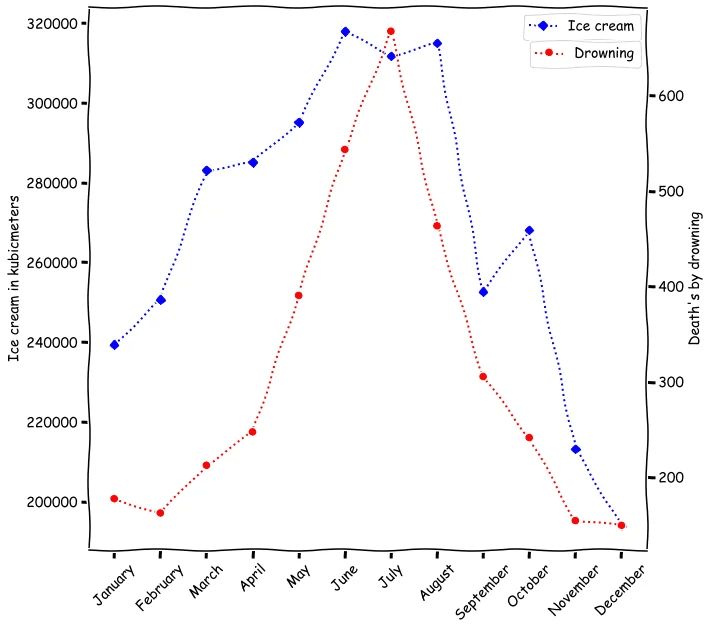
These are our best guesses for what might be going on. Just keep in mind, with statistics, you’re making informed assumptions. There’s rarely a 100% certain answer. Factors such as the time of year, upcoming holidays, or economic fluctuations can all have a significant impact on your website traffic and sales. And remember, just because two things happen at the same time doesn’t mean one caused the other: correlation doesn’t always mean causation!
E.g Here's a graph between drownings, and ice-cream sold
What to take away
As a general rule of thumb, ensure you always maintain good performance on your website. You've closed off any significant technical issues with the Screaming Frog SEO Spider, and your marketing keywords are well-defined and targeted for your specific audience.
However, above everything else, make sure you hire a marketer who actually cares.
And there is more to come
Thank you for coming this far with us. The above use cases are just the tip of the iceberg. When it comes to getting insights from Google Analytics, there is much more to learn.
If there are any specific issues you're having with Google Analytics and want a second set of eyes to look at it, or write a blog post, get in touch, as we always want to make the learning curve a little bit less steep, with such a gigantic analytics tool.
Stay tuned for our next blog, which will cover how to implement Google Analytics and GTAG within a Next.js application. We also discuss the difference between the tools, when to use each, and how we can implement this with something like a cal.com embed.