Welcome back to finding new, and ever more exciting ways to make ourselves redundant in the AI arms race…
I'm just messing, did you fall for that? Hook like and sinker… Let’s talk about how we can use v0 and Cursor to speed up building your frontend pipeline and actually iterate faster.
Getting started
v0 is a generative UI tool that's trained on internal best practices and uses shadcn/ui & Tailwindcss. Your app/website should be using Tailwindcss to get the most out of this article, however we've got a tip for you if it's not later in this article.
Great, now with that said let's make a couple assumptions. You’re a web developer, you’re building a website (this works with web apps too) and you’re looking to build some blocks for a page builder.
You should have:
- Some point of reference of what you want to build
- Don’t worry if you don’t have any right now, we think that the best way to learn something is by ripping off somebody else's' designs - that's why we're going to do that with TailwindUI today!
- Cursor downloaded
- If you haven’t used Cursor before, it’s basically AI integrated VS Code, but thats really underselling it. It's like saying ChatGPT is just a better version of SmarterChild
- Next.js environment
- Run
npx create-next-app@latestand pick your setup. Just make sure you choose yes on TailwindCSS. - Below is the cheat code for the best env setup
- Run
text1What is your project named? v0-turbo-mode2Would you like to use TypeScript? Yes3Would you like to use ESLint? Yes4Would you like to use Tailwind CSS? Yes5Would you like to use `src/` directory? Yes6Would you like to use App Router? (recommended) Yes7Would you like to customize the default import alias (@/*)? No8What import alias would you like configured? @/*
- A pretty short attention span
- This isn’t going to be that long of a blog, because I can’t handle writing more than a thousand words, so get strapped in... We're off!
Get to it
You’ve probably guessed why we said we’re doing a page builder, because more often than not, it’s simple building blocks that look relatively rectangle on the page.
So we’re going to start by breaking down the UI into little bitty chunks that match roughly what you want as a component. Thinking in rectangles - you want to hit ⌘ + Shift + 4 and take a perfectly rectangular screenshot of the component you want to build. Pro-tip: if you want to include things like shadows make sure you screenshot the whole of the shadow, even where it fades to white.
For a great place to get the hang of this, and to potentially upset Adam Wathan - we're going to use TailwindUI and screenshot their components.
Side note: we would genuinely recommend paying for TailwindUI at some point as well, because it has some great components.

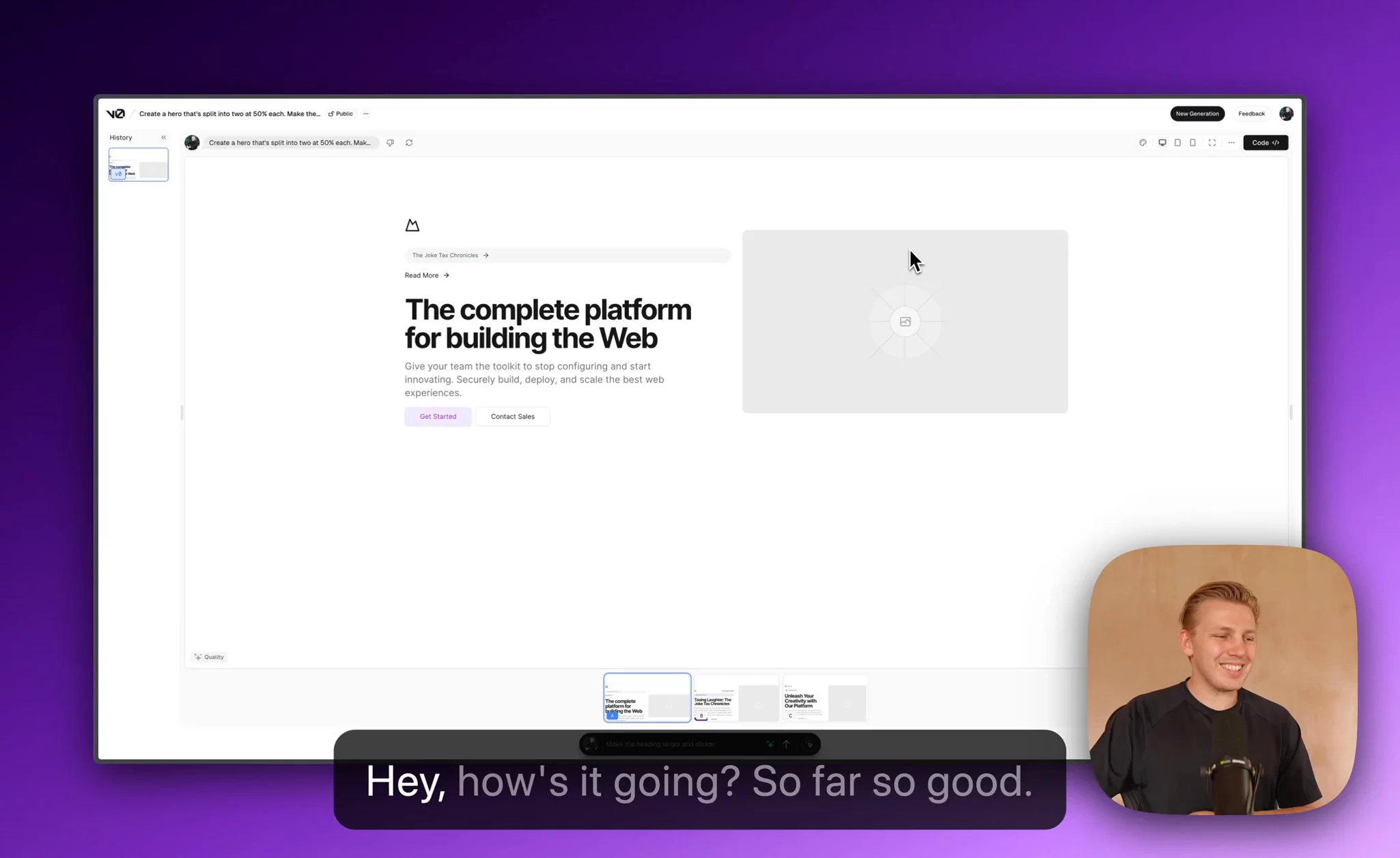
Now what you're going to do, is drop this image directly into v0 and write a brief description of what you want. Generally the more comprehensive you can describe it, the less faffing you need to do in v1,v2,v3. Basically, measure twice cut once.
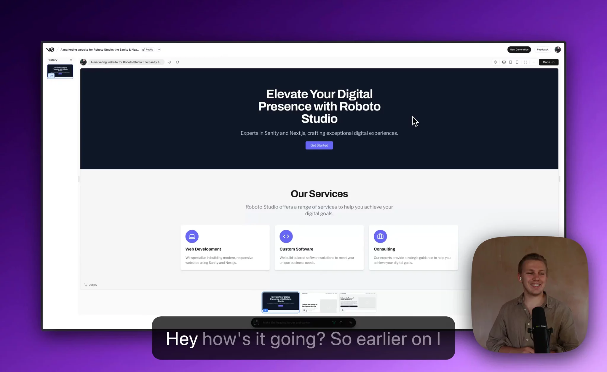
How did it turn out? Want to see ours? Here it is! In my opinion option C is the best one. But guess what? I actually didn't drop the image in there, I actually just generated that from the prompt itself without the screenshot. How about that for a twist.
Get that integrated
Because you've already setup your Next.js environment we're going to get that integrated straight away by using your UID. If you want to take ours it's npx v0 add D9PTKPabHkZ
Wonderful, now you've got a beautiful component added to your next environment and you can start hacking it together with Cursor
Bonus: customise your theme
So you're probably going to want to customise the styles that come out of v0. Because it's trained on shadcn/ui, there's a great quick way of doing this.
Check out this theme generator. Just paste in your company primary color and you're most of the way there.
Write up the worlds longest prompt
Have you ever been in a conversation where you hit a specific subject and somebody is insanely passionate about it and goes off on one? You know like accidentally asking a Linux user why their Windows look funny.
I want you to do the same thing but spill the beans for all the specifics of how you like your components developed. I’m serious.
- Do you have your components in a central column layout?
- Do you use fluid layouts or containers
- Do you use specific semantic html for specific components
- The size of your border radius
- The list goes on
Basically just go nuts and write too much content, don’t worry about it, it’s not like you’re going to have to read it.
Once you've created this, plumb this into Cursor. I'm going to give you a brief example of one of ours. It's very page-builder opinionated but it works for us and provides some consistency in the way we lay out our components.
markdown1Whenever we use a central container it will always have a default margin-y of 16 and appropriate padding, it generally is max-w-7xl unless it's specified otherwise and mx-auto to central it. Here's an example:2<section className="my-16 px-4 lg:px-0">3 <div className="mx-auto max-w-7xl>4 …5 </div>6</section>7If something has a background we typically display it like this and break pattern when it's a page builder block. Take the example above and slightly tweak it to this8<section className="my-8 px-4 lg:px-0">9 <div className=“py-8”> //Background layer10 <div className="mx-auto max-w-7xl>11 …12 </div>13 </div>14</section>1516We always prefer to use grid instead of flex unless it’s two sibling tags, in which case only then would you use a flex Here's an example where we would use flex:17<div>18 <img/>19 <p>Some text</p>20<div>21We always use appropriate semantic html22
Here's a very basic example of using the above to constrain it to a single column with the flexible container:

Let’s run through it
So we're going to take the code that we have above and show you a real world example where this becomes useful, and as a bonus we'll even bind some props and generate content based on the types of the component.
It's a bit of a hefty watch at around 10 minutes, but it shows you the full process, errors included to go from a v0 prototype all the way to a fully functional, customised page builder block.

Bonus: getting it to work with Chakra UI
Before you start asking if I'm ok, spent too much time in the sun or just having a bad day. No I'm not.
The reason why I'm adding this section is because most people will have a legacy framework, with a legacy codebase (ourselves included). So why not make it easier to migrate all these new fangled technology advances to your rickety old codebase? That's why.

The future of v0
Well, we for one are most excited about design tokens/themes being generated or pulled into v0. Any method of getting closer to that all impressive one shot, primitive component is going to be a win in our book. It'll also be great to be able to setup multiple themes for multiple clients in real time.
A footnote on future frontend developers
I've seen no end of negative sentiment across X about the future of web development and AI and how you should stop working towards it as a career path. It's bollocks. The only thing this is going to do is distinguish you against the masses with the ability to create a UI in the same time it took 'little Timmy purist' to build a 'perfectly crafted' button.
For those old enough to remember dreamweaver days... Do you think any business said - "Well gee whizz, I sure hope we can hire more developers that spend 15 minutes to create a button by writing the text inside a png in photoshop and exporting it out". Of course they didn't, they wanted the fresh new folks that were able to add a string of text to their buttons natively in html, and style it with bootstrap. That's who got hired.
Don't miss the wave, learn how to code & prompt and get faster at making things good. It's really not that hard if I'm understanding it.


